ShopDreamUp AI ArtDreamUp
Deviation Actions


Suggested Deviants


Suggested Collections


You Might Like…


Featured in Groups


Description
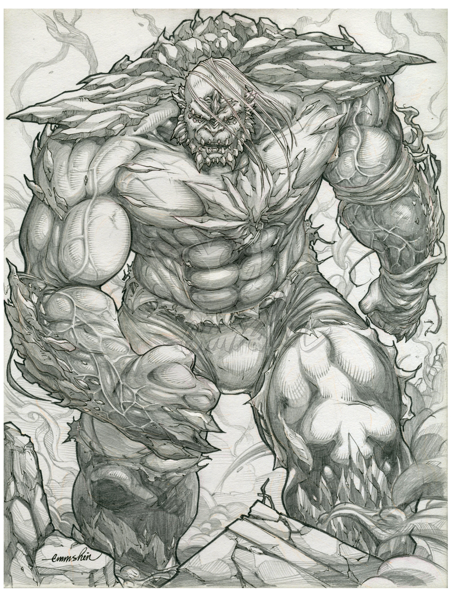
My Fanart Lineart: DC Comics (c) "Doomsday"
My first artwork for the 2013, what a great way to start the year with a Doomsday. . .artwork (Smile)")
Hope you like it, have a great year 2013..
Please feel free to check out my gallery.. thank you!
previously on my gallery:


My first artwork for the 2013, what a great way to start the year with a Doomsday. . .artwork
Hope you like it, have a great year 2013..
Please feel free to check out my gallery.. thank you!
previously on my gallery:
Image size
914x1202px 997.54 KB
© 2013 - 2024 EmmShin
Comments144
Join the community to add your comment. Already a deviant? Log In
You've done a good job displaying medium values, but it needs darker tones. Also, instead of an outline for the entire character, try having variable dynamic lines that make things pop that should be in the foreground to create more depth. His right arm and left leg should have bolder outlines if you chose to have them, while the ones in the background should have thinner yet still noticeable lines. Same thing with your pen or pencil strokes. The farther away, the broader and less detailed they should be. Otherwise then the lack of depth you have done a good job.